VI
Thanh Ta,Website design and Acuity integration for a Pilates method in New York.
- Client
- Thanh Ta, Pilates, New York
- Year
- 2023
- Made
- Website · Brand guide · Booking portal (Acuity)
- Status
- thanhta.com is no longer online; the pictures are the case study's
Thanh's method focuses on four pillars of wellness: alignment, positioning, movement, and bodywork.
Read more
Project overview
Thanh Ta
Thanh's method focuses on four pillars of wellness: alignment, positioning, movement, and bodywork. Our singular goal was to achieve a holistic design that incorporated all four of the pillars through the use of color and lines.
QWARTER designed Thanh's website, brand guide, and created a booking portal for Thanh's clients to book directly on the website. Using her four pillars as design inspiration, Thanh's vision was to create an experience that was a balance between structure and flow.
- 4
- Pillars of the method: alignment, positioning, movement, bodywork
- 3
- Ways to book: in-studio, in-home, virtual
- 2023
- The year qwarter.com's case study gives
- 5
- Colours in the brand guide
Thanh Ta
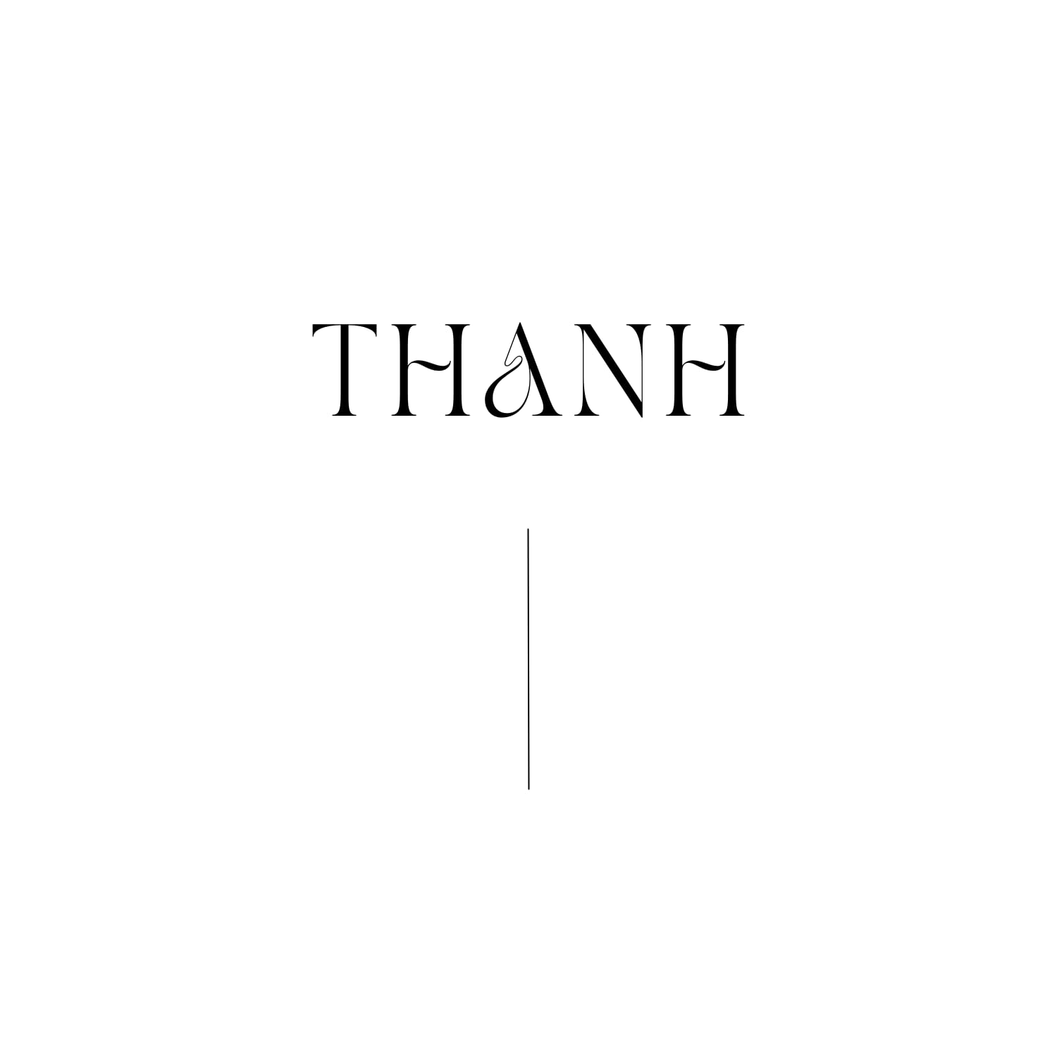
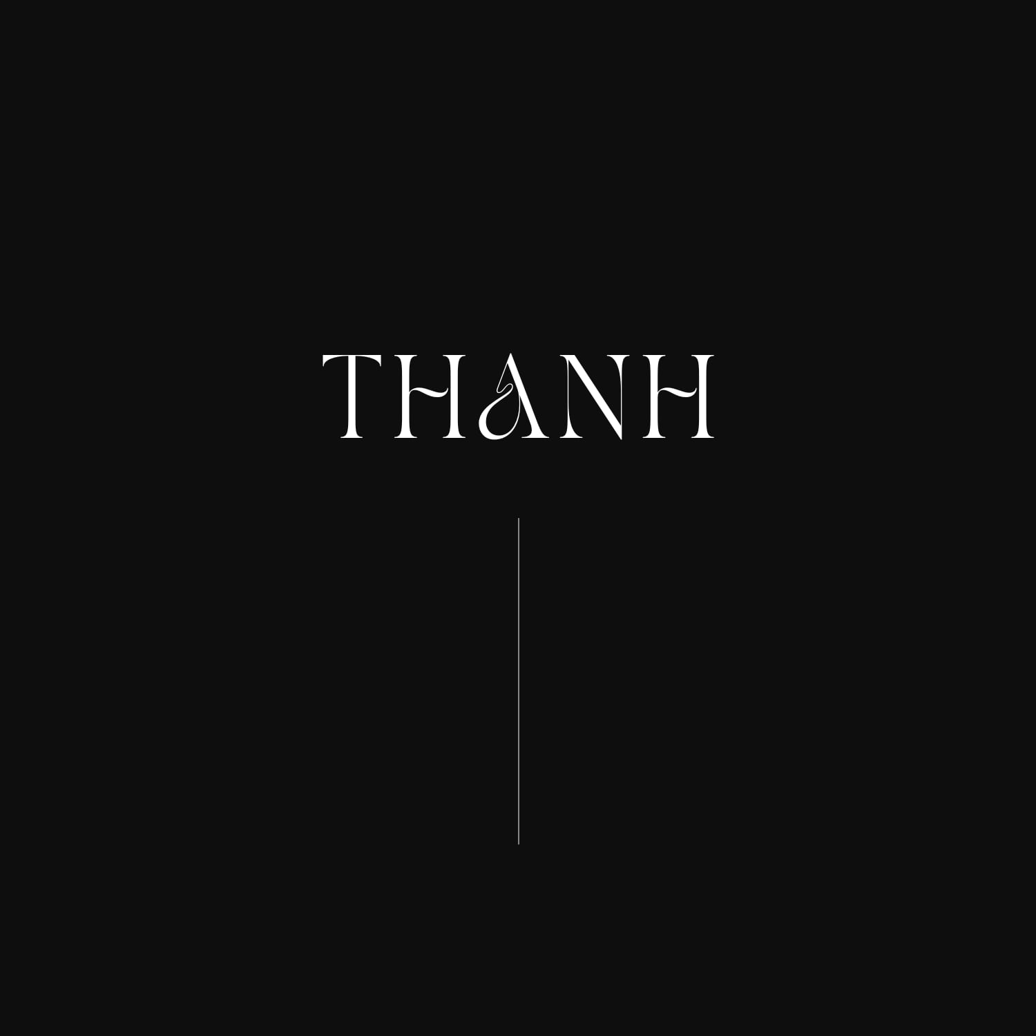
Logo
THANH, as the brand guide draws it: the letters with the open A, the mark qwarter.com's case study shows on white, on black and on its own.
- terracotta#975030
- steel blue#476D82
- near black#0A0606
- grey#6B6B6B
- light grey#C1C1C1
Thanh Ta
Colour
The five colours qwarter.com's case study lists under Style & Imagery: the terracotta and the steel blue of the four pillars, with near-black and two greys.
TANS PEARL
Headings · 32pt and Semi Bold 24pt
THANH · BOOK A SESSION TODAY · CONTACT
Comfortaa
Text · Ultra Light 16pt
ABCDEFGHIJKLMNOPQRSTUVWXYZ abcdefghijklmnopqrstuvwxyz 0123456789
Thanh Ta
Type
The type samples the case study sets: TANS PEARL at 32 and 24 points, Comfortaa Ultra Light at 16.
Thanh Ta
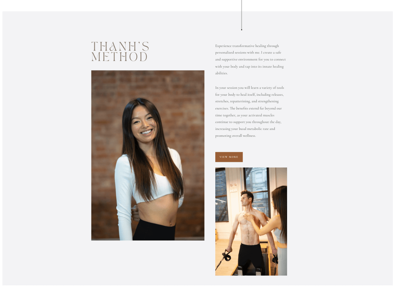
The home page
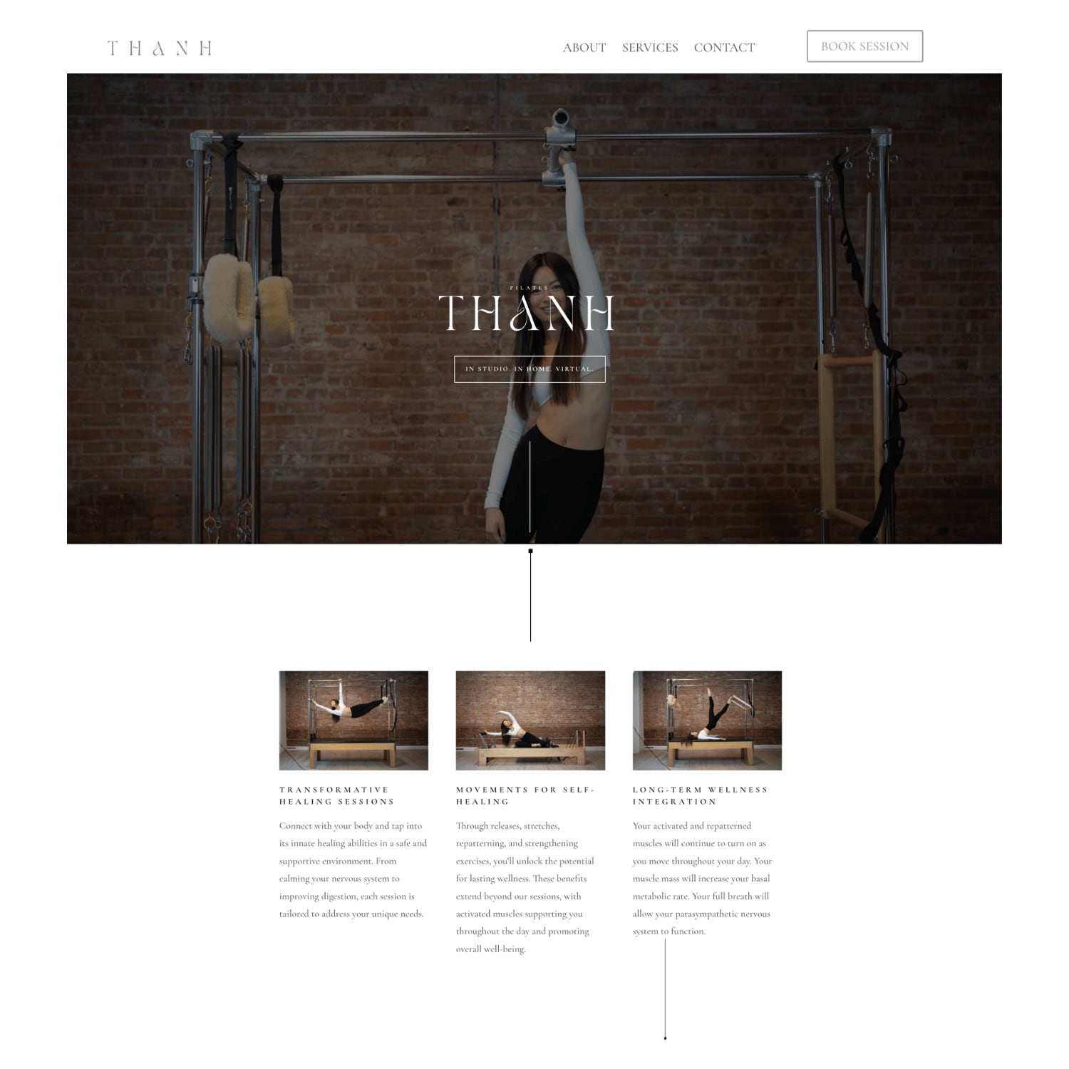
The home page as the case study shows it: THANH over the studio, In studio · In home · Virtual under it, the three sessions below.
Design note
The site, as the case study shows it
Thanh's method focuses on four pillars of wellness: alignment, positioning, movement, and bodywork. Our singular goal was to achieve a holistic design that incorporated all four of the pillars through the use of color and lines.
Design note
The solution
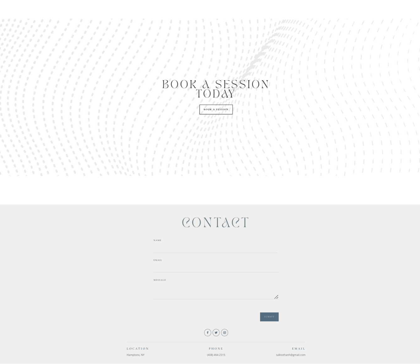
Leveraging Acuity and developing an integration for booking and scheduling directly on the website was part of solving the challenge. The next challenge was creating an easy way to navigate between in-studio, in-home, virtual single sessions or packages. Clients have the option to book a virtual, in-studio, in-home session or package straight from the menu.
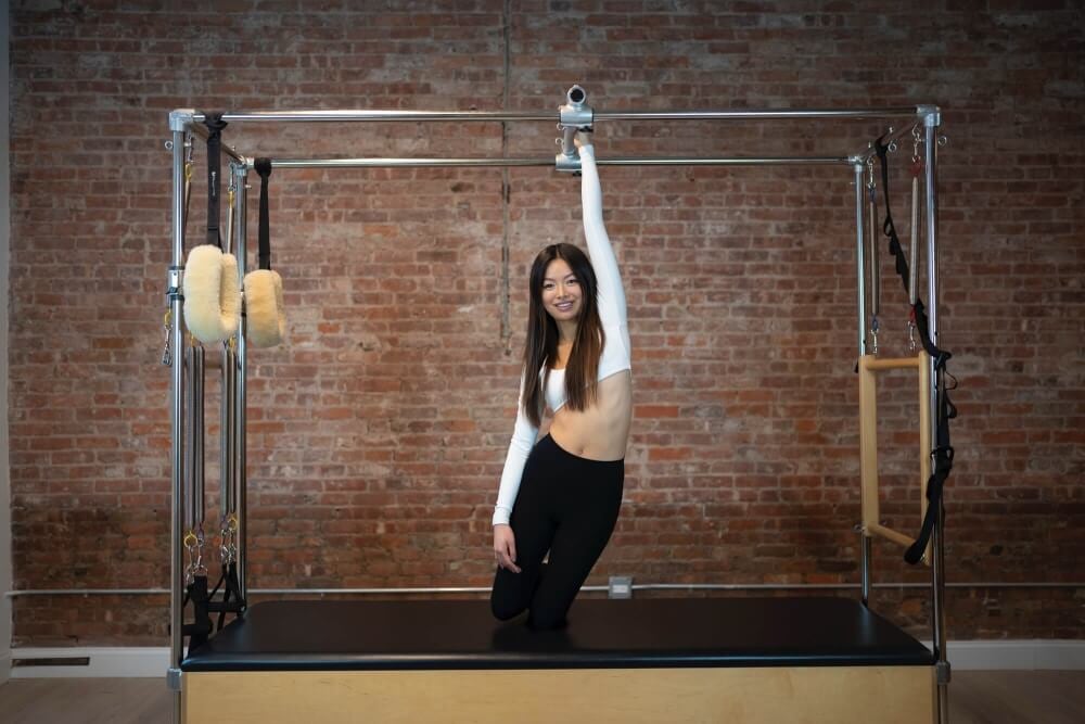
“Connect with your body and tap into its innate healing abilities in a safe and supportive environment. From calming your nervous system to improving digestion, each session is tailored to address your unique needs.”
Design note
Design strategy
QWARTER designed Thanh's website, brand guide, and created a booking portal for Thanh's clients to book directly on the website. Using her four pillars as design inspiration, Thanh's vision was to create an experience that was a balance between structure and flow.
thanhta.com is no longer online; the pictures are the case study's
Want one like it?
Next project