Logos Used to Be Art
Logos used to be art.
Or, at least, treated as such.
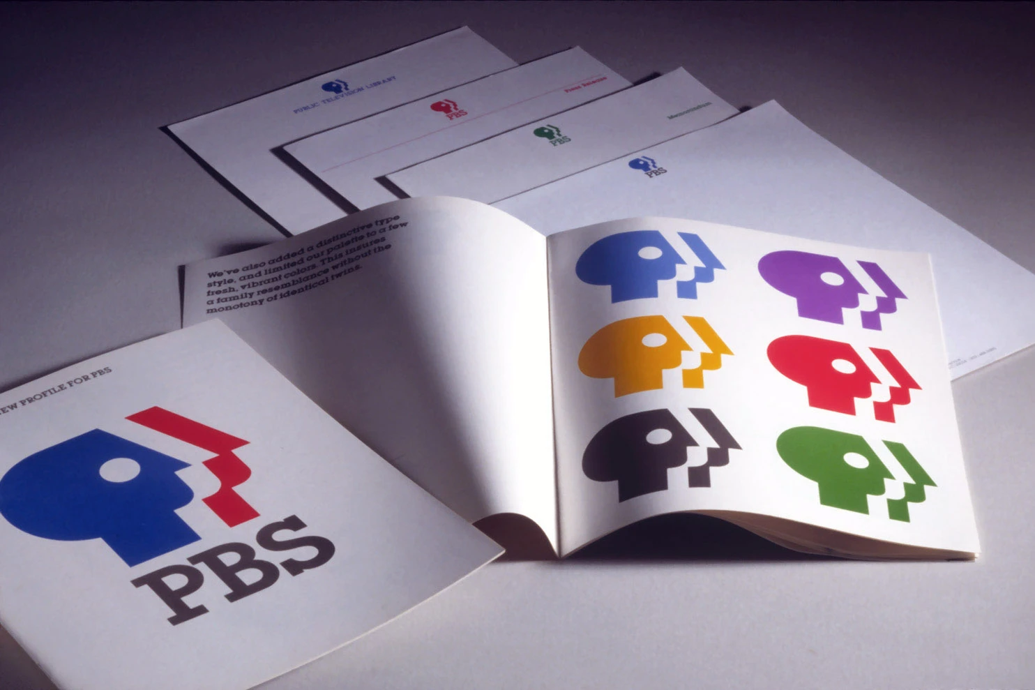
This vintage PBS logo was created by the legendary Tom Geismar back in 1984.
His firm, Chermayeff & Geismar, has crafted logos for NBC, Mobil, Chase Bank, National Geographic and the Smithsonian.
A symbol of people
PBS’ three-profile mark developed the earlier P-head idea into a symbol of the people who make up its public.
The profiles face forward. The repeated outlines suggest a wider audience. The P connects the symbol to PBS.
The logo was intended to be immediately recognizable, both in color and in black and white.
The intention is humanistic: a symbol of people, ideas and culture rather than a corporate monogram.
A point of view
Something that’s missing from a lot of advertising, branding and design we see today is a point of view. Because of this, much of the work put out by brands and agencies falls flat.
It’s fascinating to me that a logo created over four decades ago, which is itself quite flat, evokes such a tremendous amount of emotion.
When you’re creating advertising, branding or design for yourself or a brand, it’s worth asking: why?
If you don’t have a good answer as to why something is being created in the way you’re creating it, consider going back to the drawing board.