
Ogilvy’s Rule of Typography
XLII / 01David Ogilvy
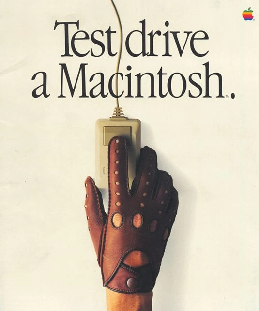
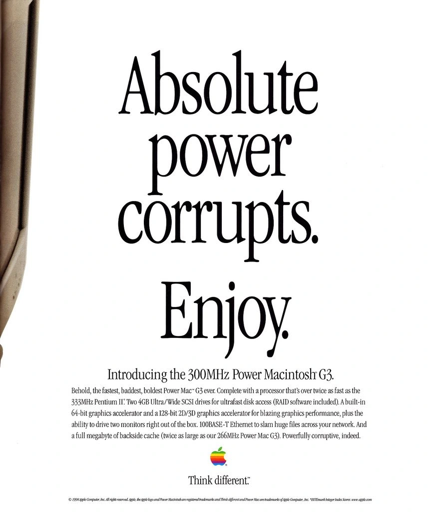
What do these ten ads have in common?
They follow David Ogilvy’s cardinal rule of typography.
Ogilvy forbade his teams from using reverse type. He hated seeing white text on a dark background.
Why?
Because reverse type is difficult to read. It slows down the reader and reduces overall readership.
Some of the greatest ads of all time follow Ogilvy’s rule. You will find a few of those below.

XLII / 02David Ogilvy
The message comes first
Here’s what I like about Ogilvy’s rule: it simplifies ads, provides healthy creative constraints and focuses the eye on the messaging.
In advertising, simpler is better.
I’m not a stickler about this rule at Honey Copy.
But after looking at these legendary ads, perhaps I should be.

XLII / 03David Ogilvy


XLII / 04David Ogilvy



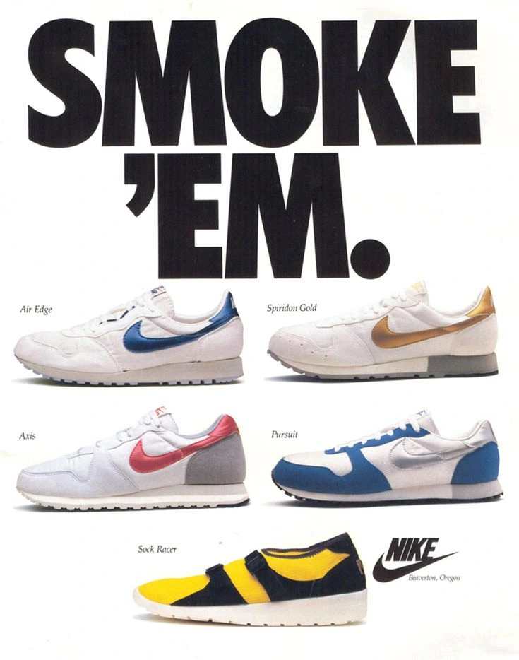
Make the message easy to read.
References
Keep following your curiosityOne lesson leads